FLYER - Virtual English Test app
FLYER - Virtual English Test app
A fun & effective way to practice for English exam
A fun & effective way to practice for English exam
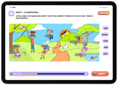
When we launched exam.flyer.us, we focused on desktop use for better student concentration. However, not all students have access to a laptop or PC, and internet issues posed challenges. To address this, we developed the FLYER mobile app, released in May 2023, tailored to meet user needs and goals.
When we launched exam.flyer.us, we focused on desktop use for better student concentration. However, not all students have access to a laptop or PC, and internet issues posed challenges. To address this, we developed the FLYER mobile app, released in May 2023, tailored to meet user needs and goals.





Roles
Roles
Product Owner
Sole User Experience (UX) Designer
Sole User Interface (UI) Designer
Interaction (IxD) Designer
Visual designer
Product Owner
Sole User Experience (UX) Designer
Sole User Interface (UI) Designer
Interaction (IxD) Designer
Visual designer
Project specifications
Project specifications
Duration: 8 weeks for 1st version
Tools:
Figma
Photoshop
Illustrator
Lotties
Duration: 8 weeks for 1st version
Tools:
Figma
Photoshop
Illustrator
Lotties
Deliverables
Deliverables
Product Design:
Empathy user: User personas
Competitive audit
User surveys and interviews
User journeys and task flows
Site map
Low-fidelity wireframes
High-fidelity mockups and prototypes
Design system and UI kit
Usability tests
Visual design:
Logo mobile app
App Store Previews and Screenshots
Product Design:
Empathy user: User personas
Competitive audit
User surveys and interviews
User journeys and task flows
Site map
Low-fidelity wireframes
High-fidelity mockups and prototypes
Design system and UI kit
Usability tests
Visual design:
Logo mobile app
App Store Previews and Screenshots


Overview
Overview
Overview
Overview
Following the success of the FLYER exam website and user requests, I planned to design a mobile app for phones and tablets. This enables students to practice anytime without needing a laptop or PC. I overcame challenges of adapting content to smaller screens and leveraged website assets to ensure a seamless experience. The mobile app also reduces loading times by using pre-downloaded data, addressing user complaints about the website's load times.
Following the success of the FLYER exam website and user requests, I planned to design a mobile app for phones and tablets. This enables students to practice anytime without needing a laptop or PC. I overcame challenges of adapting content to smaller screens and leveraged website assets to ensure a seamless experience. The mobile app also reduces loading times by using pre-downloaded data, addressing user complaints about the website's load times.
Challenges
Challenges
Adapting extensive text and image-rich tests to smaller screens
Maintaining the engaging experience of the desktop version
Ensuring consistent user experience across all devices
Reducing image loading times
Adapting extensive text and image-rich tests to smaller screens
Maintaining the engaging experience of the desktop version
Ensuring consistent user experience across all devices
Reducing image loading times
Proposed solution
Proposed solution
Introduce landscape and portrait modes for the first version
Redraw images for portrait mode as resources allow in the future
Buid feature to help user can continue their uncompleted test across devices
Pack images into the app download to reduce loading times
Introduce landscape and portrait modes for the first version
Redraw images for portrait mode as resources allow in the future
Buid feature to help user can continue their uncompleted test across devices
Pack images into the app download to reduce loading times
1
1
1
Understand Users
Understand Users
Understand Users
Research - Interviews
Research - Interviews
We conducted surveys and interviews to understand user needs and goals.
I called our top 20 users to gather insights on:
Their demographics and how they discovered FLYER
Their thoughts and actions before, during, and after using the website
Their feelings about these experiences, what do they want us to improve
Their needs for a mobile version
Targeted users
Targeted users
Our primary users are students aged 6 to 14 who need focused practice for Cambridge English tests during their primary and middle school years.
Our primary users are students aged 6 to 14 who need focused practice for Cambridge English tests during their primary and middle school years.
User personas


Lan Anh Nguyen
Age
8
Gender
Girl
Grade
8
School
THCS Nguyen Hong
Location
Nghe An, Vietnam
I need an engaging and interactive platform that makes learning English fun.
Brief story
Nguyen Lan Anh is a curious 8-year-old from a suburban area. She loves exploring new things and is excited to improve her English skills for school and future. Her mother really wants her to get a high score in the next Movers test next month
Goals
Become more confident in her English abilities, both academically and socially.
Excel in her Cambridge English tests and impress her teachers and parents.
Frustrations
Frustrated when she encounters boring or difficult learning materials that don't hold her attention.
Confused by complex grammar rules.
User personas


Lan Anh Nguyen
Age
8
Gender
Girl
Grade
8
School
THCS Nguyen Hong
Location
Nghe An, Vietnam
I need an engaging and interactive platform that makes learning English fun.
Brief story
Nguyen Lan Anh is a curious 8-year-old from a suburban area. She loves exploring new things and is excited to improve her English skills for school and future. Her mother really wants her to get a high score in the next Movers test next month
Goals
Become more confident in her English abilities, both academically and socially.
Excel in her Cambridge English tests and impress her teachers and parents.
Frustrations
Frustrated when she encounters boring or difficult learning materials that don't hold her attention.
Confused by complex grammar rules.
User personas


Lan Anh Nguyen
Age
8
Gender
Girl
Grade
8
School
THCS Nguyen Hong
Location
Nghe An, Vietnam
I need an engaging and interactive platform that makes learning English fun.
Brief story
Nguyen Lan Anh is a curious 8-year-old from a suburban area. She loves exploring new things and is excited to improve her English skills for school and future. Her mother really wants her to get a high score in the next Movers test next month
Goals
Become more confident in her English abilities, both academically and socially.
Excel in her Cambridge English tests and impress her teachers and parents.
Frustrations
Frustrated when she encounters boring or difficult learning materials that don't hold her attention.
Confused by complex grammar rules.
User personas


Lan Anh Nguyen
Age
8
Gender
Girl
Grade
8
School
THCS Nguyen Hong
Location
Nghe An, Vietnam
I need an engaging and interactive platform that makes learning English fun.
Brief story
Nguyen Lan Anh is a curious 8-year-old from a suburban area. She loves exploring new things and is excited to improve her English skills for school and future. Her mother really wants her to get a high score in the next Movers test next month
Goals
Become more confident in her English abilities, both academically and socially.
Excel in her Cambridge English tests and impress her teachers and parents.
Frustrations
Frustrated when she encounters boring or difficult learning materials that don't hold her attention.
Confused by complex grammar rules.
User personas
Lan Anh Nguyen


Age
8
Gender
Girl
Grade
8
School
THCS Nguyen Hong
Location
Nghe An, Vietnam
I need an engaging and interactive platform that makes learning English fun.
Brief story
Nguyen Lan Anh is a curious 8-year-old from a suburban area. She loves exploring new things and is excited to improve her English skills for school and future. Her mother really wants her to get a high score in the next Movers test next month
Goals
Become more confident in her English abilities, both academically and socially.
Excel in her Cambridge English tests and impress her teachers and parents.
Frustrations
Frustrated when she encounters boring or difficult learning materials that don't hold her attention.
Confused by complex grammar rules.
2
2
2
Define User needs & goals
Define User needs & goals
Define User needs & goals
Dinh Lien Ha
Dinh Lien Ha
Journey Map
Journey Map
Journey Map
Ha is a 14-year-old from a rural area who dreams of pursuing higher education and traveling the world. She understands the importance of English proficiency for achieving her ambitions.
James is a parent of two school-aged children who values education and seeks the best tools to support his children’s learning. He frequently researches educational products online.
TOUCHPOINTS
TOUCHPOINTS
FEELINGS
FEELINGS
Tasks list
Tasks list
Opportunities
Opportunities
😩
Sign up account
Sign up account
Sign up account
Enter phone number
Get OTP code
Enter OTP code and password
Enter phone number
Get OTP code
Enter OTP code and password
OTP code delayed sometimes -> Improve by using other service
Or can use Apple/Google account sign in with mobile app
OTP code delayed sometimes -> Improve by using other service
Or can use Apple/Google account sign in with mobile app
😊
Do placement test
Do placement test
Look for the main features
Look for the main features
Visit homepage
Click on “Check your level?”
Do the test
Get result & advice
Visit homepage
Click on “Check your level?”
Do the test
Get result & advice
Should show up right when users first create a profile as an onboarding so users don’t need to look for it
Give more suggestions which level should fit and how to improve to get higher level
Should show up right when users first create a profile as an onboarding so users don’t need to look for it
Give more suggestions which level should fit and how to improve to get higher level
😔
Do the first Flyers test
Do the first Flyers test
Do the first Flyers test
Click on Flyers planet
Choose a test
Do test in limited time
Click on Flyers planet
Choose a test
Do test in limited time
Loading time in website is too long makes users hard to finish test in time
Need to create more short tests
Loading time in website is too long makes users hard to finish test in time
Need to create more short tests
🤔
Check details answers
Check details answers
Check details answers
After finishing a test click on “View detail answers”
Follow all the answers and see what was incorrect
After finishing a test click on “View detail answers”
Follow all the answers and see what was incorrect
Some UI makes users confused can be improved in the long-term development
Explain the answers
Some UI makes users confused can be improved in the long-term development
Explain the answers
😊
View History
View History
View History
Click on History in homepage
Find the time user did the test
User can review the answers again or just check the score in History page
Click on History in homepage
Find the time user did the test
User can review the answers again or just check the score in History page
Need a status for each test, which are completed and which are not so user can finish it
Need a status for each test, which are completed and which are not so user can finish it
By using FLYER virtual English test app, students can boost their Cambridge English test scores with enjoyable learning experiences
By using FLYER virtual English test app, students can boost their Cambridge English test scores with enjoyable learning experiences
By using FLYER virtual English test app, students can boost their Cambridge English test scores with enjoyable learning experiences
3
3
3
Ideate
Ideate
Ideate
Competitive Audit
Competitive Audit
Competitive Audit
Competitive Audit
I conducted a comprehensive competitive audit of both indirect competitors (such as Duolingo, Quizizz, The Coach, Monkey Junior, and Babilala) and the direct competitor luyenthicambridge.com.vn. My research encompassed product offerings, pricing, website analysis, business size, target audience, unique value propositions, desktop and mobile experiences, features, accessibility, user flow, navigation, brand identity, and tone. These insights have been integrated into our product design strategy.
I conducted a comprehensive competitive audit of both indirect competitors (such as Duolingo, Quizizz, The Coach, Monkey Junior, and Babilala) and the direct competitor luyenthicambridge.com.vn. My research encompassed product offerings, pricing, website analysis, business size, target audience, unique value propositions, desktop and mobile experiences, features, accessibility, user flow, navigation, brand identity, and tone. These insights have been integrated into our product design strategy.
Rapid sketching wireframe
Rapid sketching wireframe
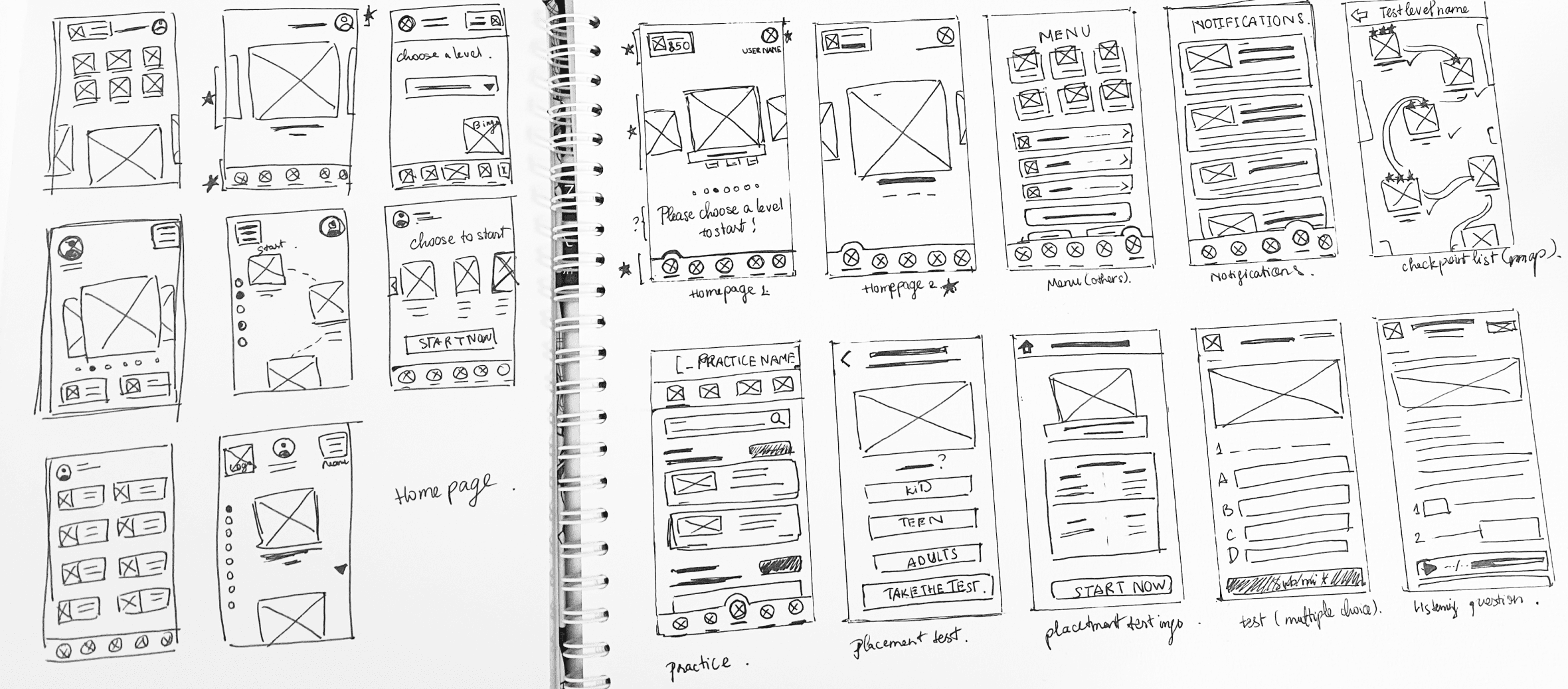
During the ideation phase, I used rapid sketching to visually conceptualize the mobile app. I focused on the users' goals and needs while adapting the website's core functionality to a smaller device. These sketches helped me explore various design patterns and identify the best solution for the product.
During the ideation phase, I used rapid sketching to visually conceptualize the mobile app. I focused on the users' goals and needs while adapting the website's core functionality to a smaller device. These sketches helped me explore various design patterns and identify the best solution for the product.


4
4
4
Prototype
Prototype
Prototype
Site map
Site map
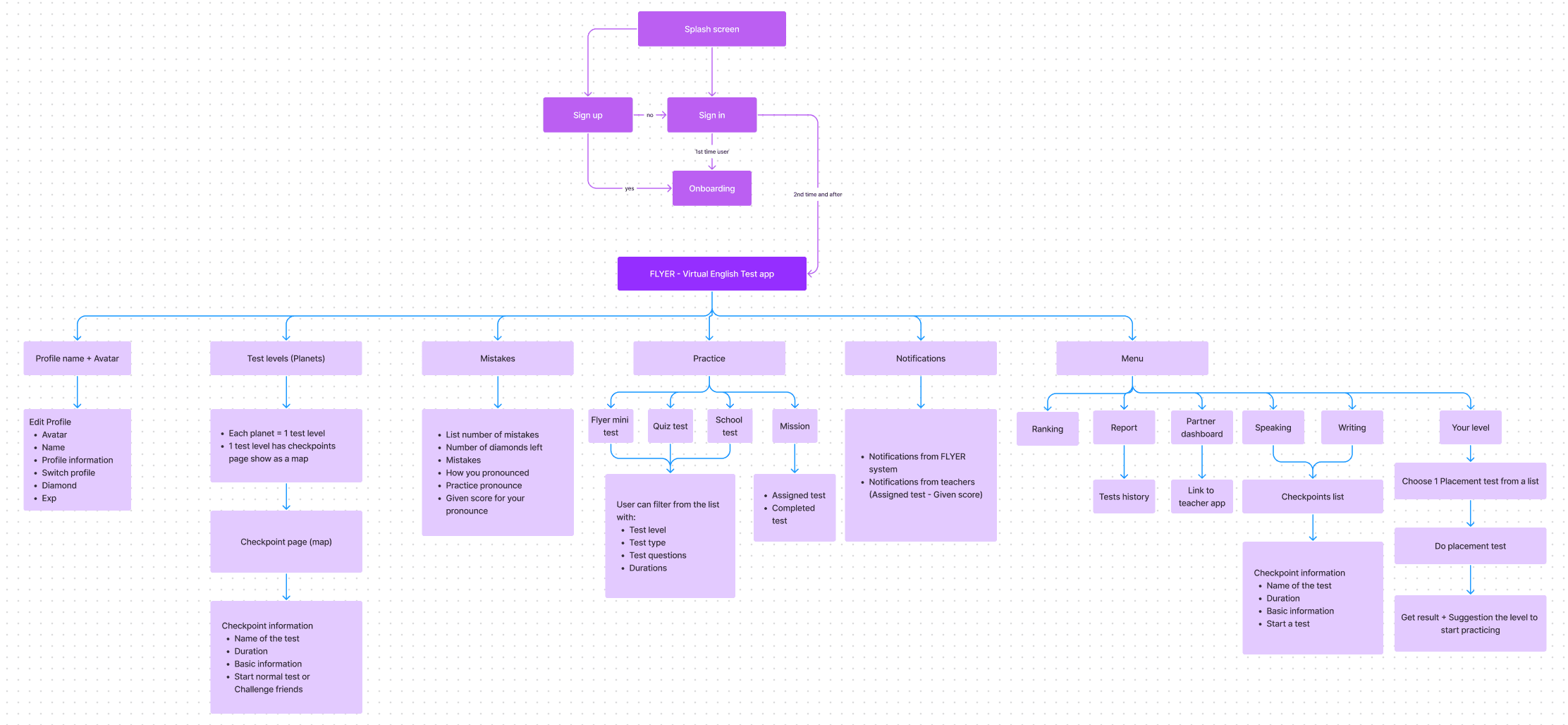
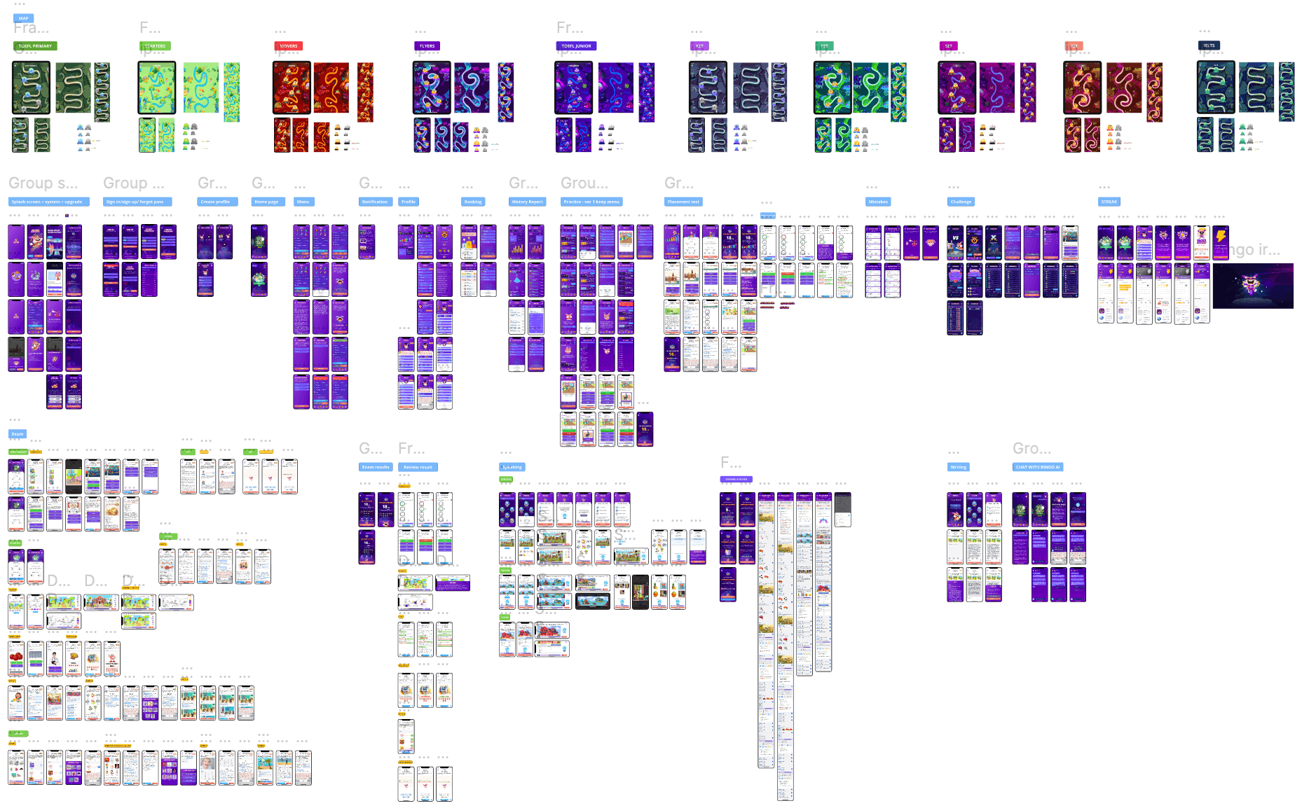
I developed a sitemap for the mobile app based on the exam.flyer.us website. My focus was on maintaining consistency across devices and ensuring a user-friendly experience to minimize confusion.
I developed a sitemap for the mobile app based on the exam.flyer.us website. My focus was on maintaining consistency across devices and ensuring a user-friendly experience to minimize confusion.


Low-fidelity prototype wireframe
Low-fidelity prototype wireframe
I created low-fidelity prototypes for key screens including the Homepage, Login, Onboarding, and Dashboard. After developing these initial prototypes, we involved stakeholders in the first round of testing to gather feedback for improvements. Here is the prototype
I created low-fidelity prototypes for key screens including the Homepage, Login, Onboarding, and Dashboard. After developing these initial prototypes, we involved stakeholders in the first round of testing to gather feedback for improvements. Here is the prototype




Hi-fidelity prototype
Hi-fidelity prototype
Hi-fidelity prototype
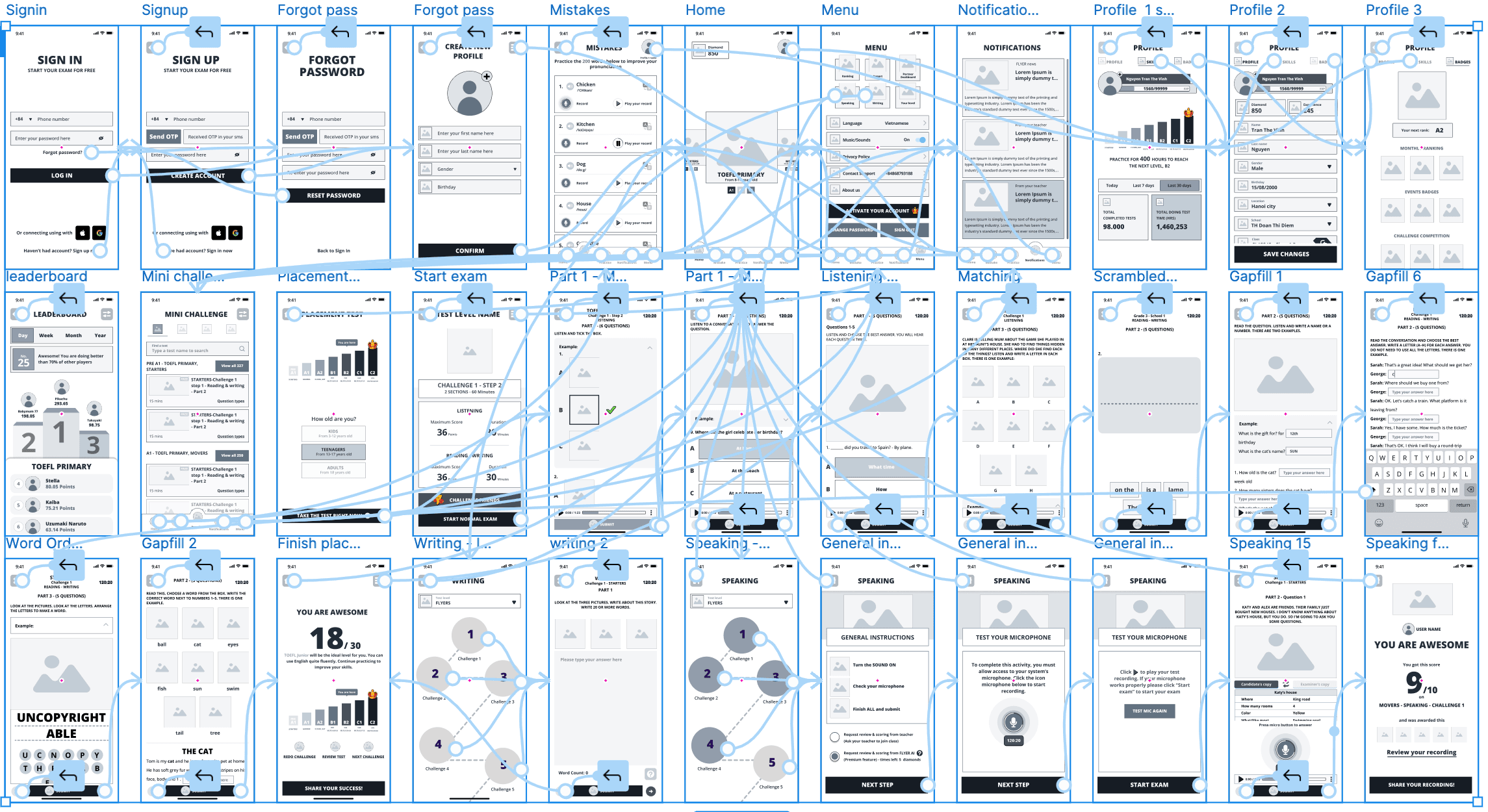
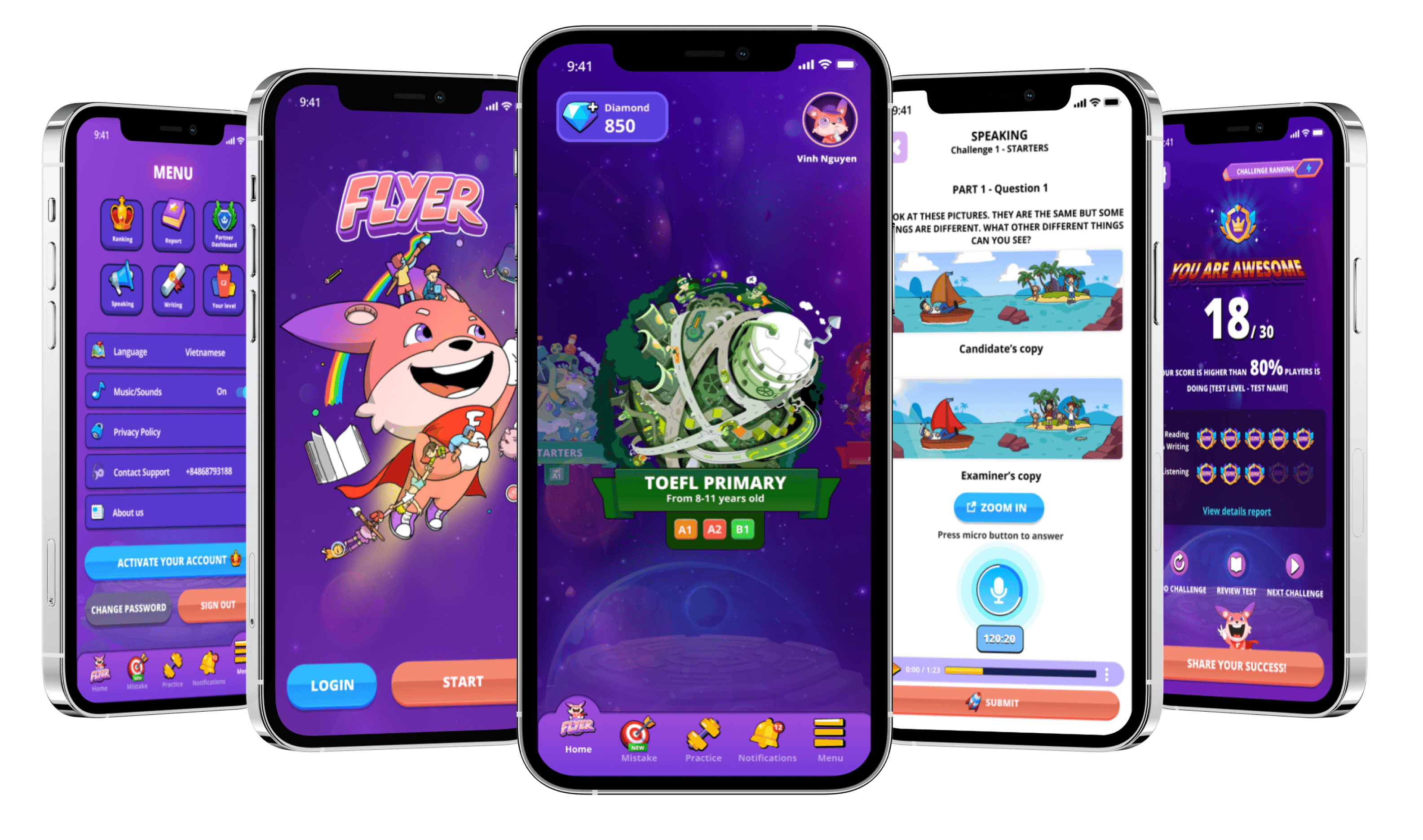
After completing the initial high-fidelity prototype, the product team conducted usability tests with users and stakeholders across various schools. We also shared the UI in multiple Facebook groups to gather user opinions and sentiments. Based on the comprehensive feedback received, we made necessary adjustments and then launched the first version of the app on the App Store and Google Play Store.
After completing the initial high-fidelity prototype, the product team conducted usability tests with users and stakeholders across various schools. We also shared the UI in multiple Facebook groups to gather user opinions and sentiments. Based on the comprehensive feedback received, we made necessary adjustments and then launched the first version of the app on the App Store and Google Play Store.
After completing the initial high-fidelity prototype, the product team conducted usability tests with users and stakeholders across various schools. We also shared the UI in multiple Facebook groups to gather user opinions and sentiments. Based on the comprehensive feedback received, we made necessary adjustments and then launched the first version of the app on the App Store and Google Play Store.
5
5
Test & Iterate
Test & Iterate
Test & Iterate
Transitioning from the MVP to a fully functional app was a long but interesting journey
Transitioning from the MVP to a fully functional app was a long but interesting journey
After launching the Minimum Viable Product (MVP), we validated our product hypotheses and quickly gathered user feedback to refine the app towards achieving product-market fit. We then continued to iterate, gradually adding features until the mobile app offered functionality comparable to the desktop website version.
After launching the Minimum Viable Product (MVP), we validated our product hypotheses and quickly gathered user feedback to refine the app towards achieving product-market fit. We then continued to iterate, gradually adding features until the mobile app offered functionality comparable to the desktop website version.


The first version
The first version
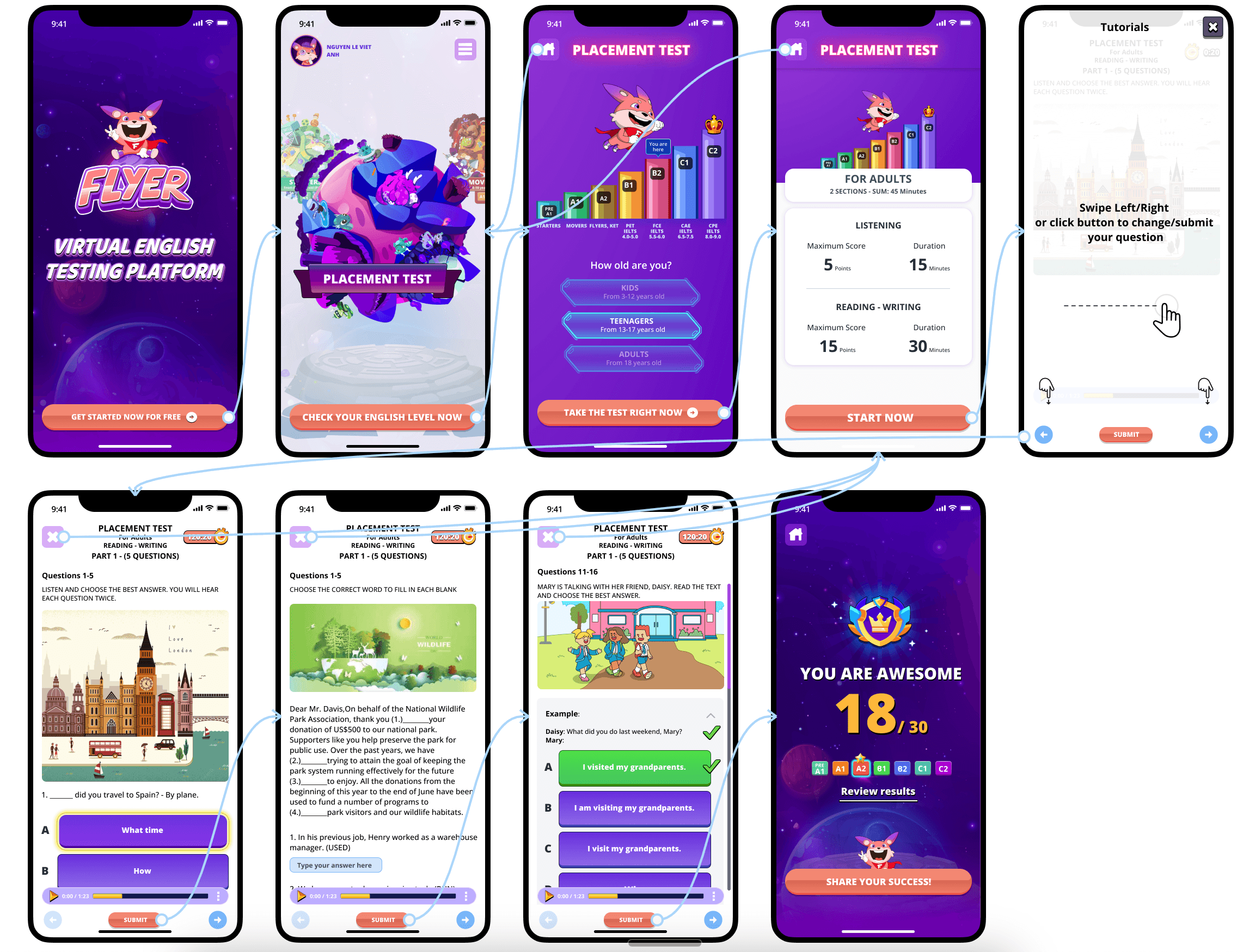
The initial version of the app was designed solely for the placement test function, with the homepage tailored specifically for this purpose. Remarkably, we developed this within a single sprint, completing the task in under two weeks.
The initial version of the app was designed solely for the placement test function, with the homepage tailored specifically for this purpose. Remarkably, we developed this within a single sprint, completing the task in under two weeks.


The next versions
The next versions
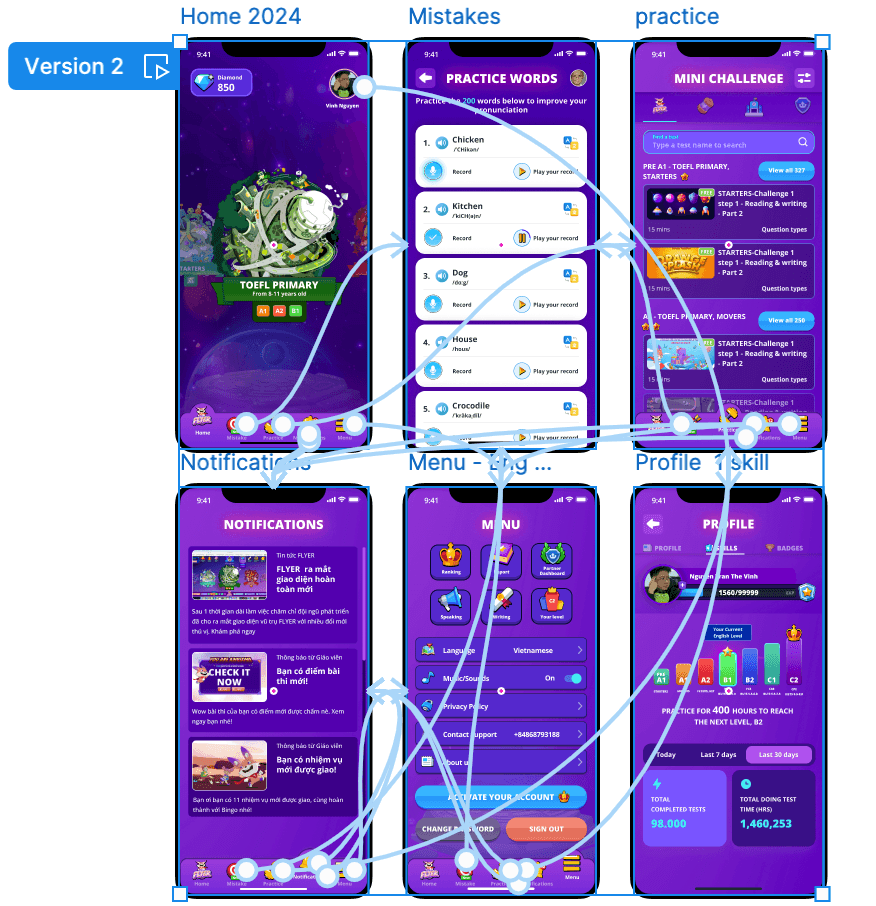
In the first phase, we streamlined the flow to focus solely on the placement test, ensuring a seamless user experience. Subsequently, we redesigned the home screen to accommodate future features and enhancements, enabling users to access a comprehensive test encompassing all question types
In the first phase, we streamlined the flow to focus solely on the placement test, ensuring a seamless user experience. Subsequently, we redesigned the home screen to accommodate future features and enhancements, enabling users to access a comprehensive test encompassing all question types
Keep user-centric in mind we improve the app continuously
Keep user-centric in mind we improve the app continuously
Each sprint, lasting about two weeks, sees the development of one new feature. We diligently progress through the design framework, starting from empathy and moving through define, ideate, prototype, and test stages. Additionally, we concentrate on key metrics, generating weekly reports to ensure we consistently deliver genuine value to our users.
Each sprint, lasting about two weeks, sees the development of one new feature. We diligently progress through the design framework, starting from empathy and moving through define, ideate, prototype, and test stages. Additionally, we concentrate on key metrics, generating weekly reports to ensure we consistently deliver genuine value to our users.




And many features have been improved
And many features have been improved
And many features have been improved
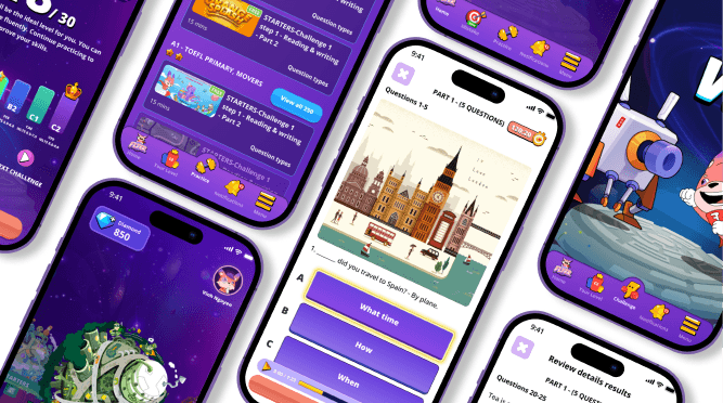
Our work on this mobile app has been extensive, with numerous enhancements and adjustments made along the way. The app has been developing, resulting in significant improvements. While I can't cover all the changes and solutions we've implemented in this case study, my involvement with the app ceased in April 2024. Therefore, the hi-fidelity prototype presented here reflects the app's state up to that time. Feel free to explore the hi-fidelity prototype provided below or download the app for a more comprehensive experience.
Our work on this mobile app has been extensive, with numerous enhancements and adjustments made along the way. The app has been developing, resulting in significant improvements. While I can't cover all the changes and solutions we've implemented in this case study, my involvement with the app ceased in April 2024. Therefore, the hi-fidelity prototype presented here reflects the app's state up to that time. Feel free to explore the hi-fidelity prototype provided below or download the app for a more comprehensive experience.
Our work on this mobile app has been extensive, with numerous enhancements and adjustments made along the way. The app has been developing, resulting in significant improvements. While I can't cover all the changes and solutions we've implemented in this case study, my involvement with the app ceased in April 2024. Therefore, the hi-fidelity prototype presented here reflects the app's state up to that time. Feel free to explore the hi-fidelity prototype provided below or download the app for a more comprehensive experience.
Improving Usability
Improving Usability
Key Issues for Long-Term Development
Key Issues for Long-Term Development
Key Issues for Long-Term Development
Enhancing the challenge mode experience.
Implementing a ranking and history feature within the app for students.
Optimizing all academic material to seamlessly integrate with the user experience. This includes adjusting images for certain question types to ensure they align properly in portrait mode, eliminating the inconvenience of switching between portrait and landscape orientations, which can be frustrating for users.
Key Lessons Learned:
Key Lessons Learned:
FLYER’s unique storytelling sets it apart, especially for kids and teens aged 6 to 14. They thrive on interactive learning with characters, which is what we aim to provide through the FLYER universe. This narrative keeps them engaged as they progress in their studies.
Prioritize speedy development cycles: Build, learn, and adapt quickly, all while staying data-driven.
Offering real value to users is crucial for attracting, converting, and retaining them.
Engage with users actively, not just through surveys or interviews, but also via social media groups. This ensures we capture their insights throughout the product's evolution.
Empathy is key in understanding users, guiding us to improve their experience without bias.
Letting users have a say in future developments, such as through surveys, empowers them and ensures we’re meeting their needs effectively.
Design
Contact me for freelance projects, full-time job or anything
you want to discuss about design. I’m happy to answer
lebichngoc15891@gmail.com
Linkedin.com/in/le-ngoc-jun158
Design
Contact me for freelance projects, full-time job or anything
you want to discuss about design. I’m happy to answer
lebichngoc15891@gmail.com
Linkedin.com/in/le-ngoc-jun158
Design
Contact me for freelance projects, full-time job or anything
you want to discuss about design. I’m happy to answer
lebichngoc15891@gmail.com
Linkedin.com/in/le-ngoc-jun158
Design
Contact me for freelance projects, full-time job or anything you want to discuss about design. I’m happy to answer
lebichngoc15891@gmail.com
Linkedin.com/in/le-ngoc-jun158
Design
Contact me for freelance projects, full-time job or anything you want to discuss about design. I’m happy to answer
lebichngoc15891@gmail.com
Linkedin.com/in/le-ngoc-jun158