Flyer website redesign
Flyer website redesign
Elevating Brand Identity Through Creative Design
Elevating Brand Identity Through Creative Design
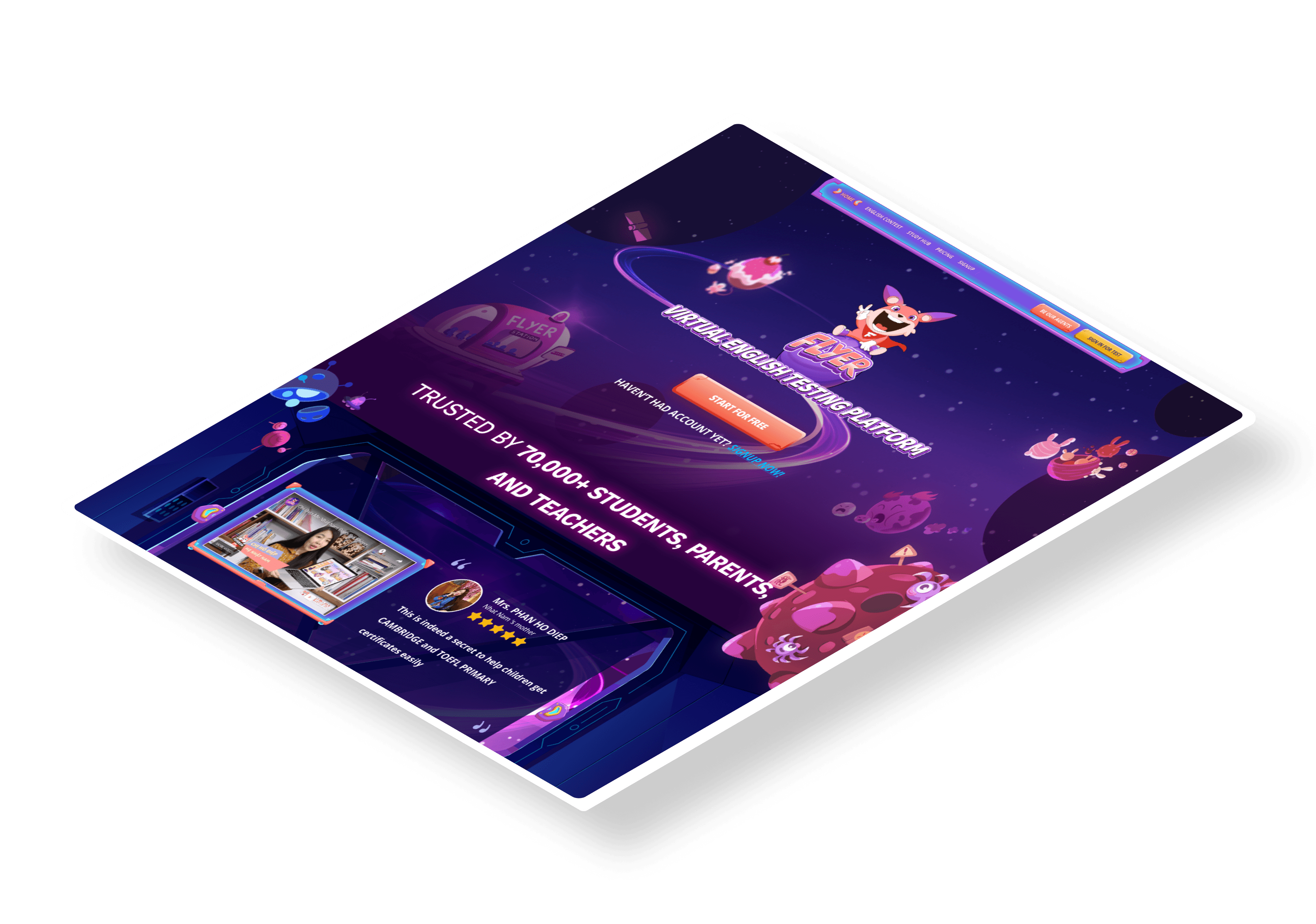
In Q1 of 2022, I embarked on the Flyer website redesign project shortly after joining the company as a Product Owner. The goal was to transform the main website to prominently reflect our brand’s identity through a cohesive narrative, distinctive color palette, and carefully selected typography.
Starting from scratch was challenging, particularly as I navigated my dual role as both Product Owner and Product Designer. Despite the challenges, I seized the opportunity to design a captivating digital gateway that would engage users and seamlessly introduce them to our product.

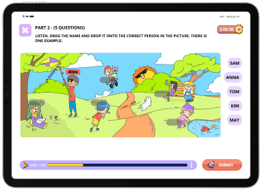










BE OUR AGENTS
start for free

HOME

Features
Flyer school
PRICING
study map
HAVEN’T HAD ACCOUNT YET? SIGNUP NOW!
START FOR FREE


BE OUR AGENTS
start for free

HOME

Features
Flyer school
PRICING
study map
HAVEN’T HAD ACCOUNT YET? SIGNUP NOW!
START FOR FREE


home

Features
Flyer school
PRICING
study map
BE OUR AGENTS
start for free
START FOR FREE
HAVEN’T HAD ACCOUNT YET? SIGNUP NOW!


home

Features
Flyer school
PRICING
study map
BE OUR AGENTS
start for free
START FOR FREE
HAVEN’T HAD ACCOUNT YET? SIGNUP NOW!


BE OUR AGENTS
start for free

HOME

Features
Flyer school
PRICING
study map
HAVEN’T HAD ACCOUNT YET? SIGNUP NOW!
START FOR FREE


BE OUR AGENTS
start for free

HOME

Features
Flyer school
PRICING
study map
HAVEN’T HAD ACCOUNT YET? SIGNUP NOW!
START FOR FREE


BE OUR AGENTS
start for free

HOME

Features
Flyer school
PRICING
study map
HAVEN’T HAD ACCOUNT YET? SIGNUP NOW!
START FOR FREE


Roles
Roles
Product Owner
Sole User Experience (UX) Designer
Sole User Interface (UI) Designer
Product Owner
Sole User Experience (UX) Designer
Sole User Interface (UI) Designer
Project specifications
Project specifications
Duration: 4 weeks for launching in April 2022
Tools:
Axure RP (Wireframe)
Figma
Photoshop
Illustrator
Duration: 4 weeks for launching in April 2022
Tools:
Axure RP (Wireframe)
Figma
Photoshop
Illustrator
Deliverables
Deliverables
Product Design for FLYER landing page + Blog:
Empathy user: User surveys and interviews
User personas
Competitive audit
User journeys and task flows
Site map
Low-fidelity wireframes
High-fidelity Prototypes
Design system and UI kit
Usability tests
Product Design for FLYER landing page + Blog:
Empathy user: User surveys and interviews
User personas
Competitive audit
User journeys and task flows
Site map
Low-fidelity wireframes
High-fidelity Prototypes
Design system and UI kit
Usability tests




Overview
Overview
Overview
Overview
My biggest challenge in this project was returning to hands-on design work after serving as a Product Manager since 2015. For years, I focused on providing strategic direction, data-driven planning, and task management for my team. This time, I had to reacquaint myself with the design process and personally undertake the redesign to align with the art guidelines, as my designer was occupied with other tasks
My biggest challenge in this project was returning to hands-on design work after serving as a Product Manager since 2015. For years, I focused on providing strategic direction, data-driven planning, and task management for my team. This time, I had to reacquaint myself with the design process and personally undertake the redesign to align with the art guidelines, as my designer was occupied with other tasks
Challenges
Challenges
The designer was occupied with other projects and couldn't use Figma.
All art resources were in large Photoshop files.
Initial communication with freelance developers was not good.
As a startup, we needed to build, learn, and grow rapidly.
The product's rich visual content benefited its appeal but hindered website loading speed.
Proposed solution
Proposed solution
I independently learned Figma to redesign this website
Converted all art assets to Figma, creating a comprehensive UI kit
Leveraged Figma’s real-time collaboration feature for seamless teamwork, efficient feedback, and faster iterations.
Focused on a sprint approach to build the first version quickly to do usability test
Utilized online tools and collaborated with the development team to optimize image sizes and reduce loading times.
The journey of leveling up our product
The journey of leveling up our product
The journey of leveling up our product
The journey of leveling up our product

Empathize users pain points and goal
Empathize users pain points and goal
Empathize users pain points and goal

Define users needs
Define users needs
Define users needs

Ideate design solutions.
Ideate design solutions.
Ideate design solutions.

Create low & hi-fidelity prototypes
Create low & hi-fidelity prototypes
Create low & hi-fidelity prototypes

Test & Iterate
Test & Iterate
Test & Iterate
How do I choose targeted users to plan a good research.
How do I choose targeted users to plan a good research.
Flyer website serves as the primary gateway for users to learn about our product before making a decision to use or purchase it. Our targeted users include teachers, parents, and students who discover our site through various channels such as Google SEO, blogs, Facebook, word of mouth, and educational institutions. These users are invested in the value our product brings to their educational experience.
Flyer website serves as the primary gateway for users to learn about our product before making a decision to use or purchase it. Our targeted users include teachers, parents, and students who discover our site through various channels such as Google SEO, blogs, Facebook, word of mouth, and educational institutions. These users are invested in the value our product brings to their educational experience.
User personas
I read about this website in the parent forums, and school recommendations. I’ll give it a try!
Brief story
James is a parent of two school-aged children who values education and seeks the best tools to support his children’s learning.
He frequently researches educational products online.
Goals
Learn about the features of the English testing platform to support his children’s exam preparation.
Understand the pricing and any available family plans.
Read user reviews and success stories to gauge the platform's effectiveness.
Frustrations
Overwhelmed by the number of educational tools available.
The old Flyer website looks too busy and can’t find what is important
The website has too many big text makes him overwhelmed
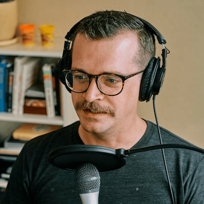
James Liu
Age
45
Gender
Male
Occupation
Youtuber
Location
China
User personas
I read about this website in the parent forums, and school recommendations. I’ll give it a try!
Brief story
James is a parent of two school-aged children who values education and seeks the best tools to support his children’s learning.
He frequently researches educational products online.
Goals
Learn about the features of the English testing platform to support his children’s exam preparation.
Understand the pricing and any available family plans.
Read user reviews and success stories to gauge the platform's effectiveness.
Frustrations
Overwhelmed by the number of educational tools available.
The old Flyer website looks too busy and can’t find what is important
The website has too many big text makes him overwhelmed
James Liu

Age
45
Gender
Male
Occupation
Youtuber
Location
China
User personas
I read about this website in the parent forums, and school recommendations. I’ll give it a try!
Brief story
James is a parent of two school-aged children who values education and seeks the best tools to support his children’s learning.
He frequently researches educational products online.
Goals
Learn about the features of the English testing platform to support his children’s exam preparation.
Understand the pricing and any available family plans.
Read user reviews and success stories to gauge the platform's effectiveness.
Frustrations
Overwhelmed by the number of educational tools available.
The old Flyer website looks too busy and can’t find what is important
The website has too many big text makes him overwhelmed
James Liu

Age
45
Gender
Male
Occupation
Youtuber
Location
China
User personas

James Liu
Age
45
Gender
Male
Occupation
Youtuber
Location
China
I read about this website in the parent forums, and school recommendations. I’ll give it a try!
Brief story
James is a parent of two school-aged children who values education and seeks the best tools to support his children’s learning.
He frequently researches educational products online.
Goals
Learn about the features of the English testing platform to support his children’s exam preparation.
Understand the pricing and any available family plans.
Read user reviews and success stories to gauge the platform's effectiveness.
Frustrations
Overwhelmed by the number of educational tools available.
The old Flyer website looks too busy and can’t find what is important
The website has too many big text makes him overwhelmed
User personas

James Liu
Age
45
Gender
Male
Occupation
Youtuber
Location
China
I read about this website in the parent forums, and school recommendations. I’ll give it a try!
Brief story
James is a parent of two school-aged children who values education and seeks the best tools to support his children’s learning.
He frequently researches educational products online.
Goals
Learn about the features of the English testing platform to support his children’s exam preparation.
Understand the pricing and any available family plans.
Read user reviews and success stories to gauge the platform's effectiveness.
Frustrations
Overwhelmed by the number of educational tools available.
The old Flyer website looks too busy and can’t find what is important
The website has too many big text makes him overwhelmed
James Liu
James Liu
Journey Map
Journey Map
Journey Map
James is a parent of two school-aged children who values education and seeks the best tools to support his children’s learning.
He frequently researches educational products online.
James is a parent of two school-aged children who values education and seeks the best tools to support his children’s learning. He frequently researches educational products online.
TOUCHPOINTS
FEELINGS
FEELINGS
Tasks list
Tasks list
Opportunities
Opportunities
😊
Visit website
Visit website
Click on the Link on FB group which was recommended from other parents
Visit website exam.flyer.us
Click on the Link on FB group which was recommended from other parents
Visit website exam.flyer.us
Add UTM source to track which channel users found the website
Add UTM source to track which channel users found the website
🤔
Look for the
main features
Look for the main features
Look for the main features
Visit homepage
Scroll down to look for the features list
Visit homepage
Scroll down to look for the features list
The Tag line + Features should go above the fold on the homepage to make users easily find out
The Tag line + Features should go above the fold on the homepage to make users easily find out
😊
Access testimonials
Access testimonials
Scroll down to find testimonials
Scroll down to find testimonials
The testimonials can come after the Featured features
The testimonials can come after the Featured features
🤔
Check pricing
Check pricing
See a pricing button
Click
Open new tab to check it
See a pricing button
Click
Open new tab to check it
Pricing should be clear.
Pricing shouldn’t distract users by putting too many colors
Pricing should be clear.
Pricing shouldn’t distract users by putting too many colors
😊
Try the product
Try the product
Click on Try now for free
Open Exam website
Start a test
Click on Try now for free
Open Exam website
Start a test
Can try a test right in the Flyer website, don't need to open Exam website
Can try a test right in the Flyer website, don't need to open Exam website
By visiting the FLYER website, customers can learn about the features the products and understand the pricing
By visiting the FLYER website, customers can learn about the features the products and understand the pricing
By visiting the FLYER website, customers can learn about the features the products and understand the pricing
User personas

James Liu
Age
45
Gender
Male
Occupation
Youtuber
Location
China
I read about this website in the parent forums, and school recommendations. I’ll give it a try!
Brief story
James is a parent of two school-aged children who values education and seeks the best tools to support his children’s learning.
He frequently researches educational products online.
Goals
Learn about the features of the English testing platform to support his children’s exam preparation.
Understand the pricing and any available family plans.
Read user reviews and success stories to gauge the platform's effectiveness.
Frustrations
Overwhelmed by the number of educational tools available.
The old Flyer website looks too busy and can’t find what is important
The website has too many big text makes him overwhelmed
User personas

James Liu
Age
45
Gender
Male
Occupation
Youtuber
Location
China
I read about this website in the parent forums, and school recommendations. I’ll give it a try!
Brief story
James is a parent of two school-aged children who values education and seeks the best tools to support his children’s learning.
He frequently researches educational products online.
Goals
Learn about the features of the English testing platform to support his children’s exam preparation.
Understand the pricing and any available family plans.
Read user reviews and success stories to gauge the platform's effectiveness.
Frustrations
Overwhelmed by the number of educational tools available.
The old Flyer website looks too busy and can’t find what is important
The website has too many big text makes him overwhelmed
Competitive Audit
Competitive Audit
Competitive Audit
Competitive Audit
To generate ideas and gain valuable insights, I conducted a comprehensive competitive audit. This analysis included both indirect competitors (such as Duolingo, Quizizz, The Coach, Monkey Junior, and Babilala) and the direct competitor, luyenthicambridge.com.vn. This audit provided a thorough understanding of the competitive landscape, helping to inform strategic decisions for the redesign of the English testing platform website.
To generate ideas and gain valuable insights, I conducted a comprehensive competitive audit. This analysis included both indirect competitors (such as Duolingo, Quizizz, The Coach, Monkey Junior, and Babilala) and the direct competitor, luyenthicambridge.com.vn. This audit provided a thorough understanding of the competitive landscape, helping to inform strategic decisions for the redesign of the English testing platform website.
Site map
Site map
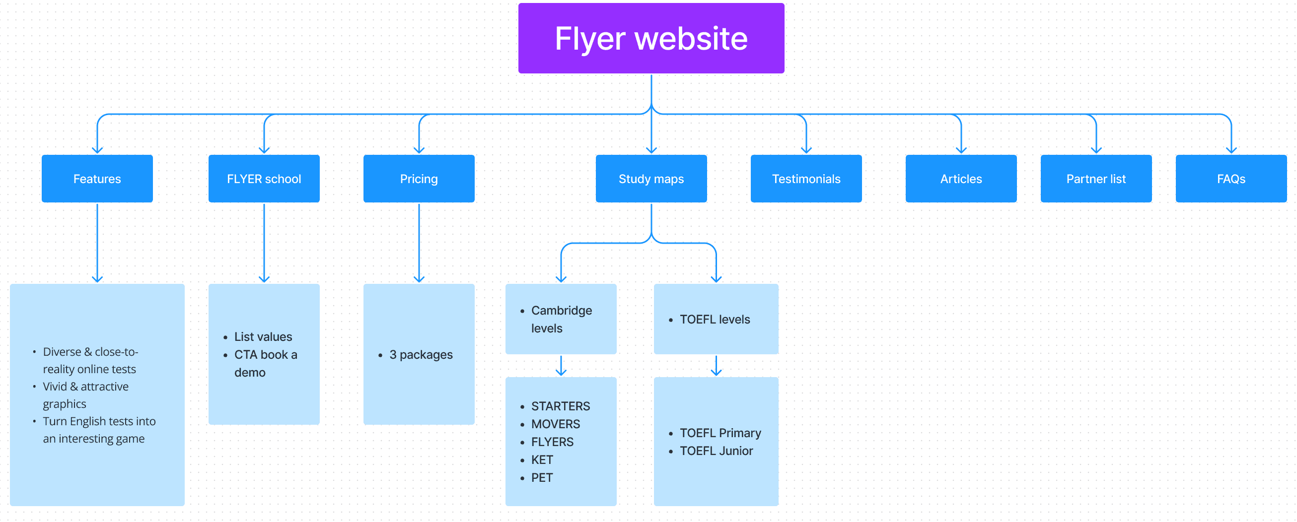
Mapping out the site structure was surprisingly quick, taking only about 30 minutes. Unlike some of my past projects, this one wasn't overly complex. This step really helped me get a good sense of how everything is laid out and spot any pages that were missing or in the wrong place.
Mapping out the site structure was surprisingly quick, taking only about 30 minutes. Unlike some of my past projects, this one wasn't overly complex. This step really helped me get a good sense of how everything is laid out and spot any pages that were missing or in the wrong place.




Rapid sketching for ideation
Rapid sketching for ideation
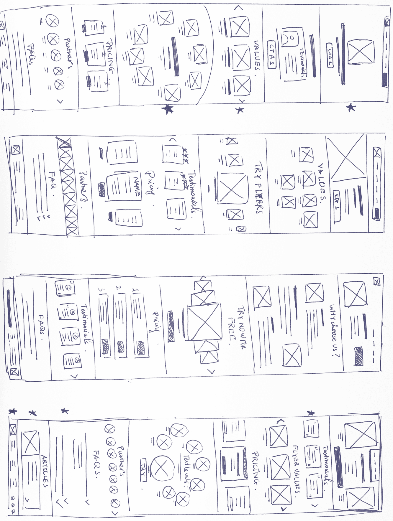
To foster creativity and generate a range of ideas, I engaged in rapid sketching. This process allowed me to explore various concepts freely and without judgment. By combining the most promising elements from these sketches, I was able to create a cohesive wireframe that integrates the best ideas.
To foster creativity and generate a range of ideas, I engaged in rapid sketching. This process allowed me to explore various concepts freely and without judgment. By combining the most promising elements from these sketches, I was able to create a cohesive wireframe that integrates the best ideas.
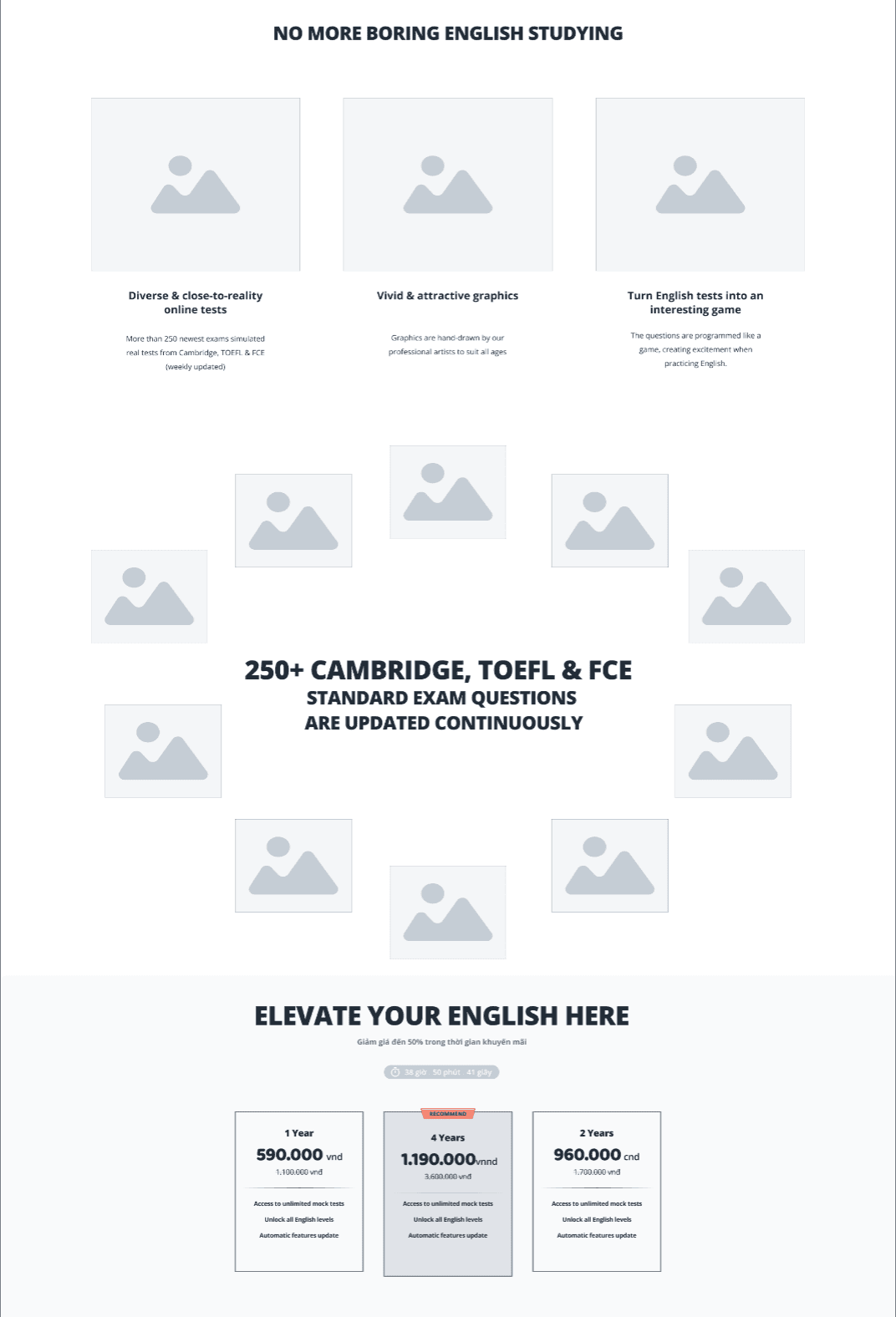


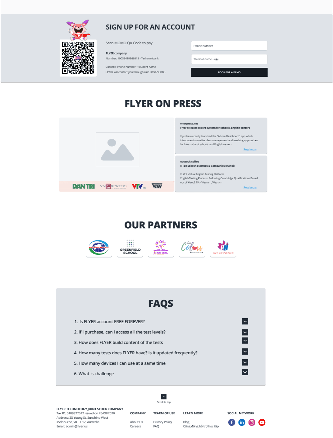


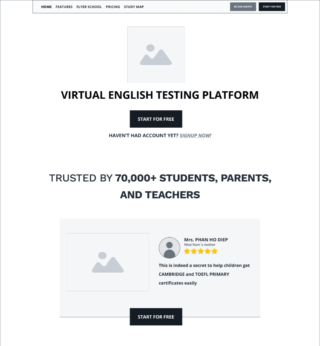


Low-fidelity prototype wireframe
Low-fidelity prototype wireframe
Following the ideation phase, I developed a low-fidelity prototype (Click here to view). This initial prototype was created quickly to capture the core layout and functionality. I then presented it to stakeholders to gather their feedback, which was essential for refining the design before progressing to the high-fidelity prototype.
Following the ideation phase, I developed a low-fidelity prototype (Click here to view). This initial prototype was created quickly to capture the core layout and functionality. I then presented it to stakeholders to gather their feedback, which was essential for refining the design before progressing to the high-fidelity prototype.
Hi-fidelity prototype
Hi-fidelity prototype
Hi-fidelity prototype
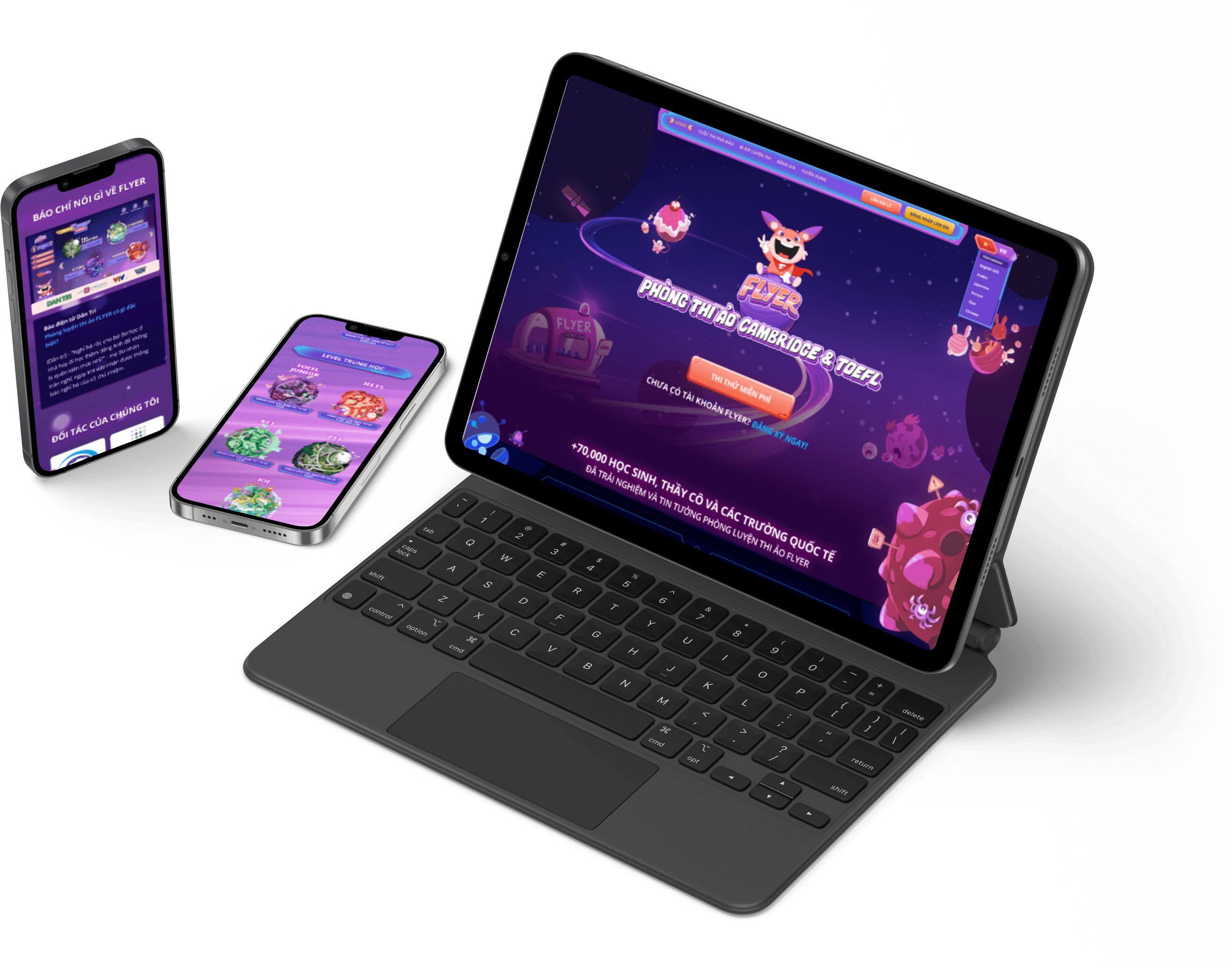
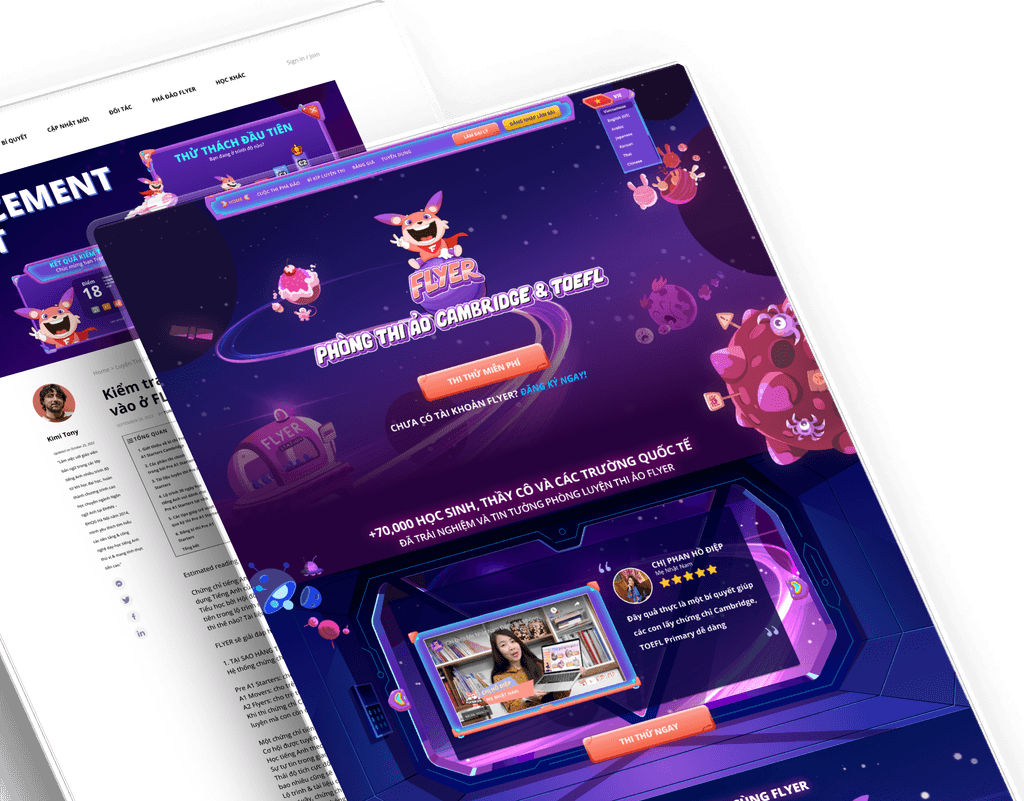
We developed multiple versions of the high-fidelity prototype before selecting the final design for development. Following the brand guidelines ensured consistency, scalability, and responsiveness across devices. Using a grid-based structure kept the design cohesive and adaptable. Close collaboration with the development and QA teams ensured the design worked flawlessly on all platforms.
Preview the Hi-fidelity prototype here




Coding development
Coding development
Coding development
Coding development
Working with freelance developers was challenging, as I was used to powerful in-house teams. To ensure the code matched my design, I also handled QA. Despite the startup challenges, persistence led to a final version that was about 80% aligned with my original design.
Working with freelance developers was challenging, as I was used to powerful in-house teams. To ensure the code matched my design, I also handled QA. Despite the startup challenges, persistence led to a final version that was about 80% aligned with my original design.
Working with freelance developers was challenging, as I was used to powerful in-house teams. To ensure the code matched my design, I also handled QA. Despite the startup challenges, persistence led to a final version that was about 80% aligned with my original design.
Working with freelance developers was challenging, as I was used to powerful in-house teams. To ensure the code matched my design, I also handled QA. Despite the startup challenges, persistence led to a final version that was about 80% aligned with my original design.
Revamp a website is an exciting but not an easy task
Revamp a website is an exciting but not an easy task
As a Product Owner, I recognized that the landing page (Homepage FLYER on Flyer.us) was crucial for making a strong first impression not just for my users but also the partners and investors. The old version was cluttered and overwhelming, with no clear focal points. To address this, I conducted user research, gathered insights, and reviewed the product story from the art director. Based on this information, I created a streamlined and engaging new homepage.
As a Product Owner, I recognized that the landing page (Homepage FLYER on Flyer.us) was crucial for making a strong first impression not just for my users but also the partners and investors. The old version was cluttered and overwhelming, with no clear focal points. To address this, I conducted user research, gathered insights, and reviewed the product story from the art director. Based on this information, I created a streamlined and engaging new homepage.
The brand guideline
The brand guideline
The brand guideline
The brand guideline
When I joined the team, I was fortunate to have an existing graphic, mascot, color, and typography guideline created by the Art Director. My task was to adjust and expand on these elements.
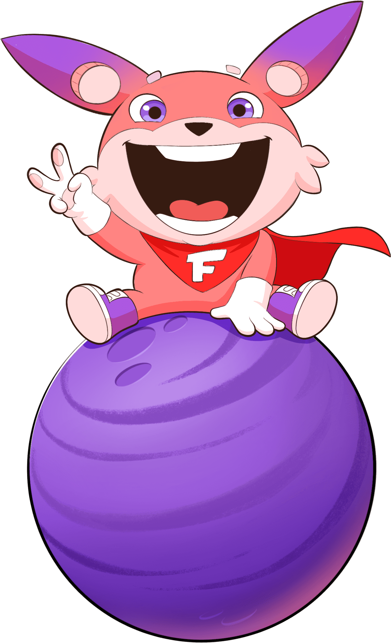
Enter the epic tale of Bingo, the brave dog from Planet F. His quest: to find Earth's top students to help him collect mystical stones and save his home from an evil villain. The design, bursting with cosmic colors and space-themed visuals, perfectly captivates kids aged 6-14.


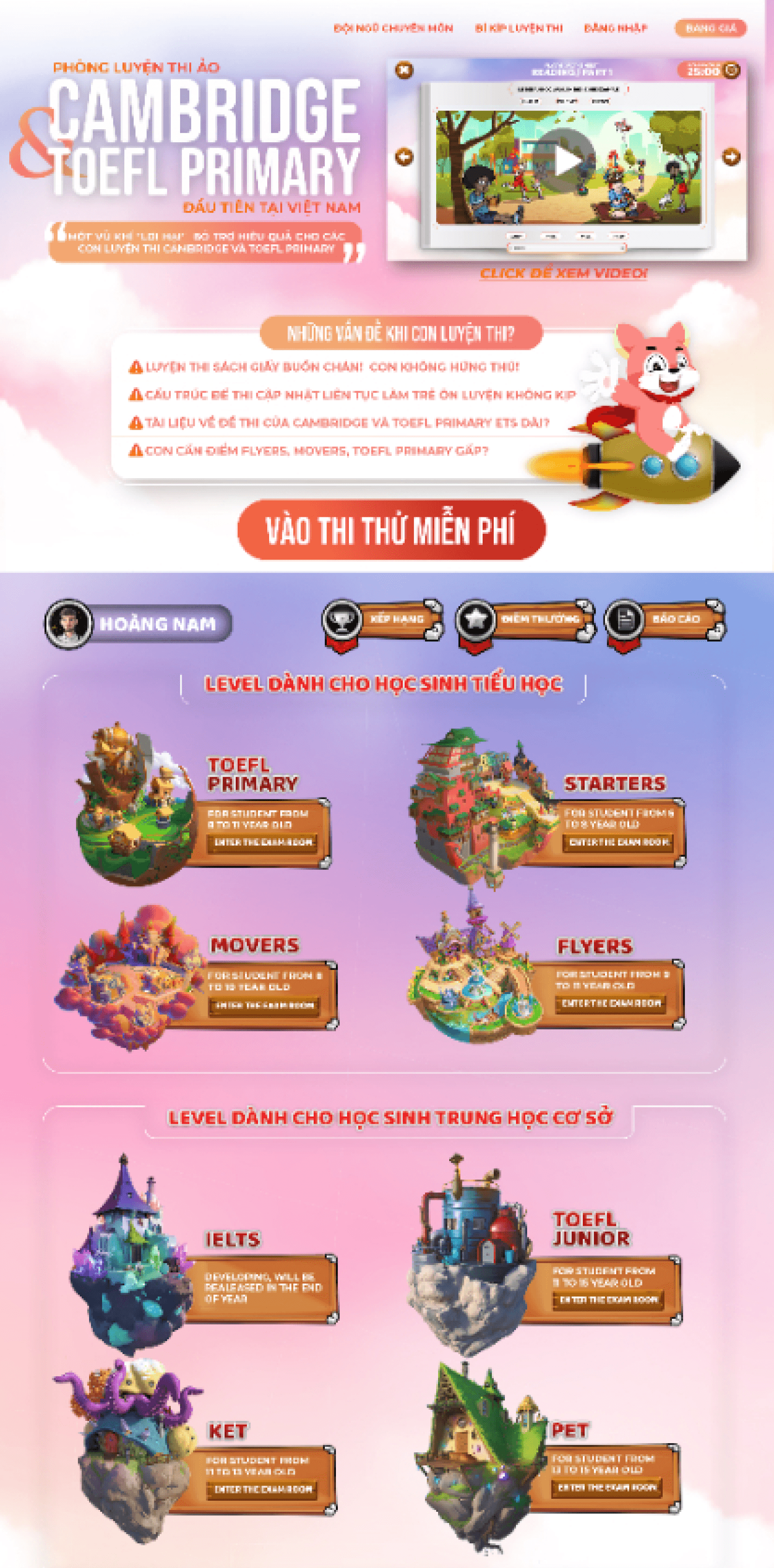


The previous version
The previous version
The old design didn't match the new brand guidelines, causing usability issues. Call-to-action elements blended in with other content, important information was hard to find due to poor hierarchy, and too many fonts use disrupted visual coherence. Insufficient color contrast also impacted accessibility and readability. Users were also hard to find the pricing packages.
The old design didn't match the new brand guidelines, causing usability issues. Call-to-action elements blended in with other content, important information was hard to find due to poor hierarchy, and too many fonts use disrupted visual coherence. Insufficient color contrast also impacted accessibility and readability. Users were also hard to find the pricing packages.
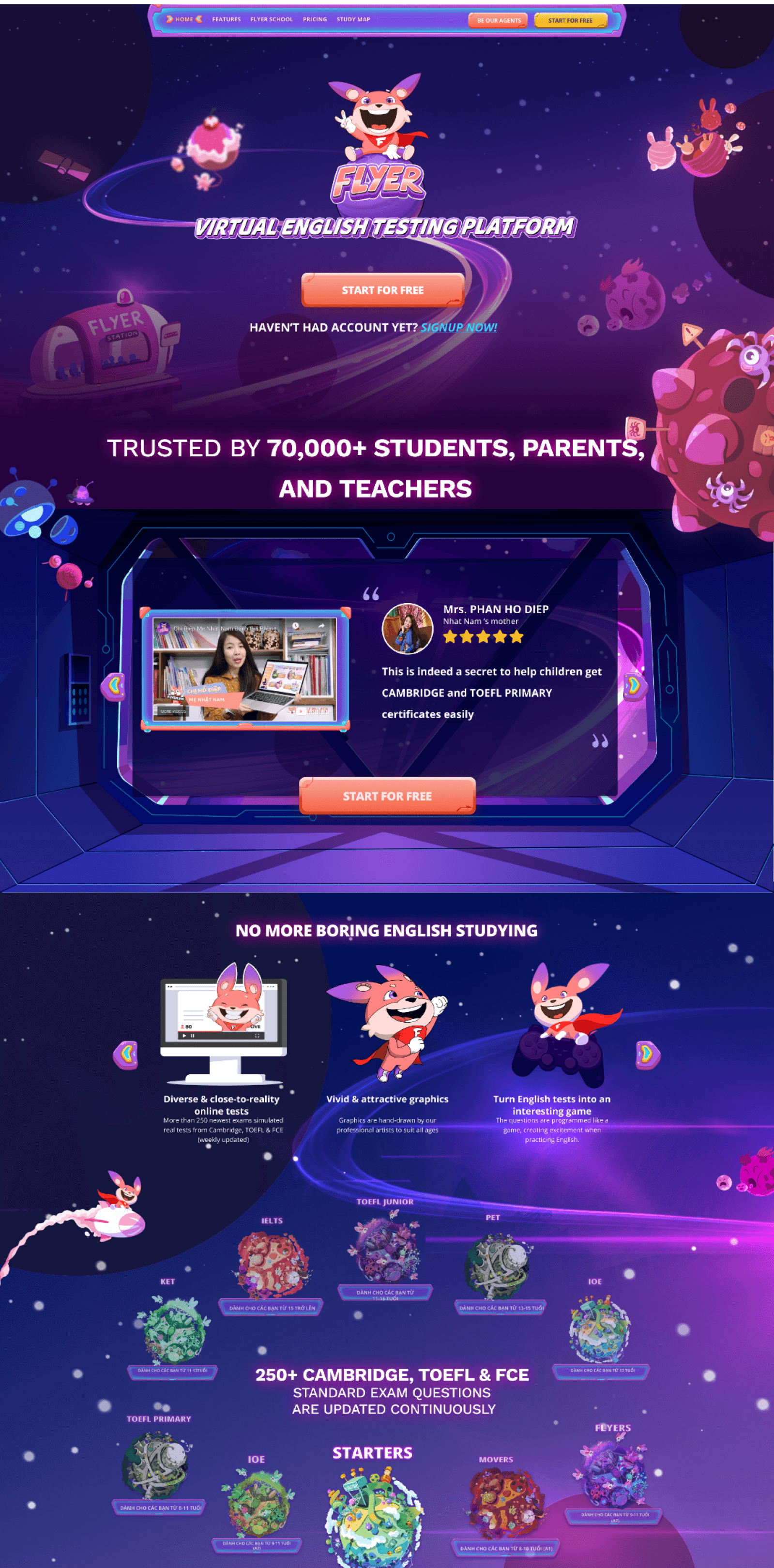


Redesigned version
Redesigned version
I aligned the redesign with the brand guidelines, using colors, typography, and storytelling to make the brand stand out. The space theme and spaceship art help tell the product story dynamically. I focused on design principles like hierarchy and proportion while keeping user goals and needs at the forefront.
I aligned the redesign with the brand guidelines, using colors, typography, and storytelling to make the brand stand out. The space theme and spaceship art help tell the product story dynamically. I focused on design principles like hierarchy and proportion while keeping user goals and needs at the forefront.
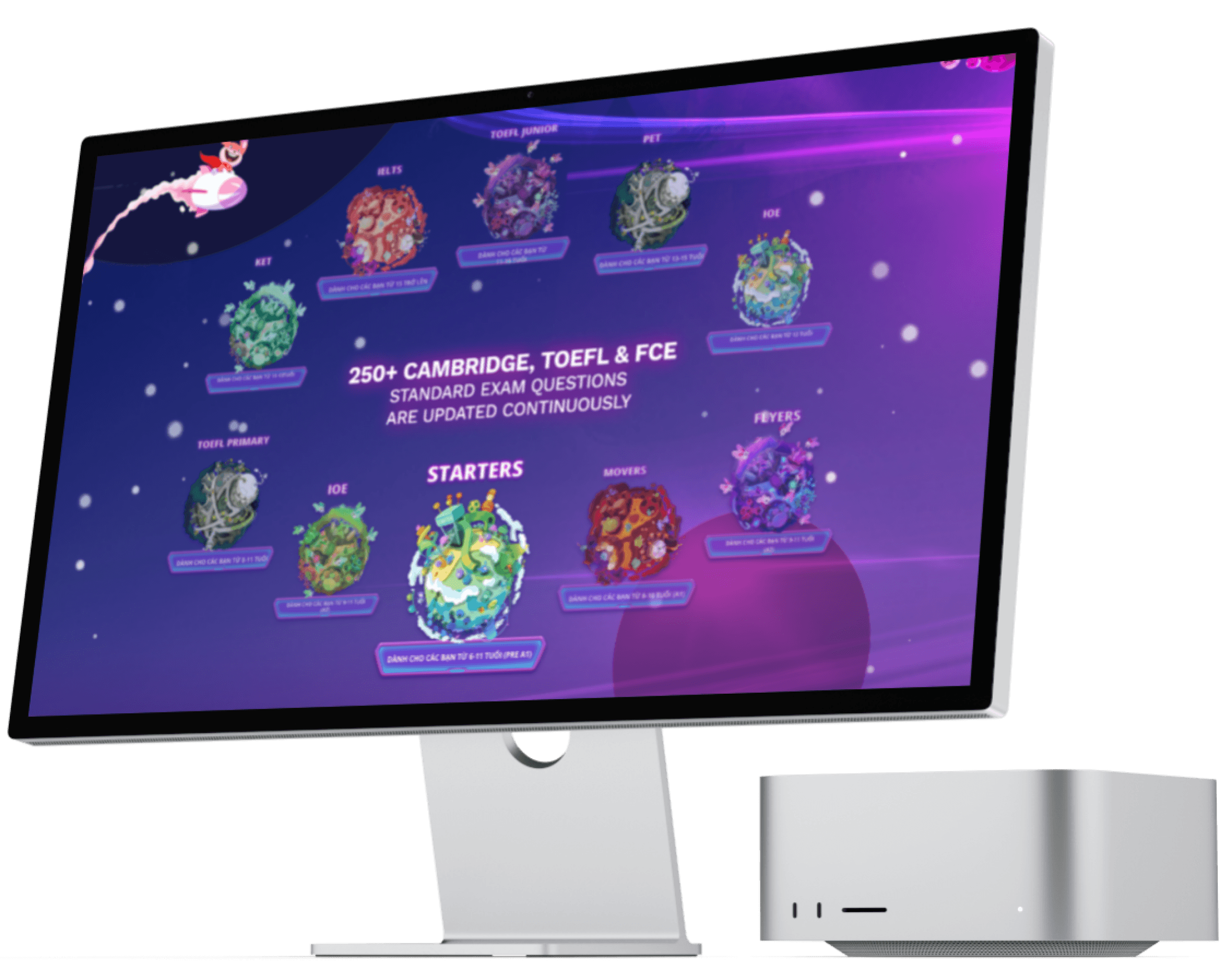


Focusing on users pain point, we try to bring a new experience
Focusing on users pain point, we try to bring a new experience
To address user pain points, we focused on delivering an improved experience based on insights from user interviews.
Identified Pain Points:
Difficulty finding FLYER product values and pricing
Unclear next steps for users
Hard to read
Implemented Solutions:
Applied hierarchy, scale, typography, and color to enhance clarity and navigation
Lessons Learned:
Lessons Learned:
This project was my first using a new tool (Figma) and my first solo design in a long time. Despite the short timeline and development challenges, I gained valuable lessons that reignited my passion for product design.
Key Takeaways:
Team Collaboration: A cohesive team and agile methodology are crucial, especially in a startup with tight deadlines.
Focus on Goals: Prioritize project goals and user needs over the plethora of "nice-to-have" features, and stay firm against external pressures during sprint demos.
Planning and Metrics: Develop a detailed analysis plan before launch and continuously track relevant metrics to guide iterations and measure success.
Reflecting on both successes and failures provided insights and inspiration for future projects.
Design
Contact me for freelance projects, full-time job or anything
you want to discuss about design. I’m happy to answer
lebichngoc15891@gmail.com
Linkedin.com/in/le-ngoc-jun158
Design
Contact me for freelance projects, full-time job or anything
you want to discuss about design. I’m happy to answer
lebichngoc15891@gmail.com
Linkedin.com/in/le-ngoc-jun158
Design
Contact me for freelance projects, full-time job or anything
you want to discuss about design. I’m happy to answer
lebichngoc15891@gmail.com
Linkedin.com/in/le-ngoc-jun158
Design
Contact me for freelance projects, full-time job or anything you want to discuss about design. I’m happy to answer
lebichngoc15891@gmail.com
Linkedin.com/in/le-ngoc-jun158
Design
Contact me for freelance projects, full-time job or anything you want to discuss about design. I’m happy to answer
lebichngoc15891@gmail.com
Linkedin.com/in/le-ngoc-jun158